雅思写作Task1小作文饼状图范文--多饼图(3)
问题相似?试试立即获取解答吧~
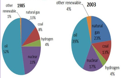
摘要:小站雅思频道这里和大家分享小作文饼状图的9分范文,真题是:The pie charts show the proportion of the energy produced from different sources in a country between 1985 and 2003.
Task:The pie charts show the proportion of the energy produced from different sources in a country between 1985 and 2003.
参考范文:
The pie charts present the change of the percentage of the energy produced from various sources in a particular country from 1985 to 2003.
It is clear that oil was the most dominant sources from which the energy was produced throughout the whole period, although it dropped from 52% in 1985 to 39%. Likewise, nuclear also declined, but much less significantly to 17%, becoming the third primary source from which the energy was produced.
The percentage of natural gas, on the other hand, witnessed the most noticeable increase during the period, rising from 13% in 1985 to 23% in 2003. Coal and other renewable resources, though whose increase was less marked, rising by 5% and 3% respectively.
Interestingly, the proportion of the energy produced from the hydrogen remained stable in 1985 and 2003, making it the least used sources from which the energy was produced.
Overall, oil, natural gas and nuclear still constitute a larger proportion of all the sources, while other three sources, namely coal, hydrogen and other renewable, are less used when producing the energy.
(177 words)


 沪公网安备
31010602002658号
沪公网安备
31010602002658号