【小站出品】2016年11月5日雅思考试小作文范文
问题相似?试试立即获取解答吧~
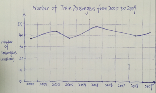
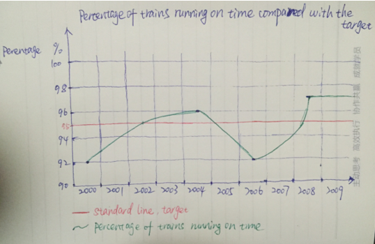
摘要:11月5日雅思写作考试真题小作文考的是双线折线图题:第一张图表显示了从2009到2000的火车乘客数量。第二个图表显示了从2000到2009的火车的百分比。。我们来看小站老师的范文怎么说的。
Task:The first graph below shows the number of train passengers from 2000 to 2009. The second graph shows the percentage of trains running on time from 2000 to 2009.
Sample answer:
The line graphs provide information about the number of train passengers from 2000 to 2009 and the proportion of trains running on time during the same period.
As can be seen from the first line graph, the number of trains’ passengers almost remained stable with some ups and downs within the range of 37 million-47 million from 2000 to 2009.
From the second line graph, we can see that the percentage of trains that ran on time experienced a upward trend from 92% in 2000 to 96% in the middle of 2004, although in the first half period the figure kept below the standard line (95%). Then the proportion of trains running on time declined dramatically to the lowest point of only 92%(the same figure in 2000) in the middle of 2006 before increasing to the highest point(97%) in the middle of 2008. After that the trend kept steady.
It is clear that the number of train passengers were around 40 million and despite some dramatic fluctuation, the percentage of trains running on time finally reached 97%, which was a little higher than the standard line.
(186 words)


 沪公网安备
31010602002658号
沪公网安备
31010602002658号